


Flat Design has become a popular trend for app and website designs. Love it or hate it, the term “flat design” is in every article written regarding the latest web design trends and has come to stay.
With major companies like Apple, with the launch of the iOS 7 or Microsoft with Metro, changing their design aesthetic to that of flat design, this trend has recently become very popular.

Above: Apple IOS 7

Above: Microsoft Metro
But where did flat design come from? And why is it important? As with anything, knowing where a style or technique came from and the history behind it can help you make more educated decisions when it comes to the use of it.
What is Flat Design?
“Flat design” is mainly the term given to the style of design in which elements lose any type of stylistic characters that make them appear as though they lift off the page.
This means removing stylistic characters such as drop shadows, gradients, textures, and any other type of design that is meant to make the element feel three-dimensional.
Flat Design can create sort of a timeless design because by removing design styles that can easily cause their design to become outdated, designers are “future-proofing” their work so that they become relevant for longer periods of time.
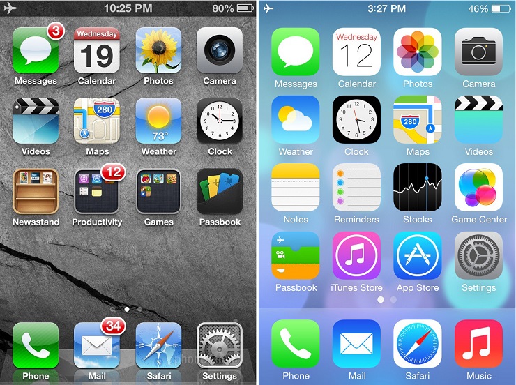
Above: Differences between IOS 6 and IOS 7
Flat design reverts back to the basics of design as a functional tool. A website is designed and judged by how well it works, as opposed to what it looks like.
So where did flat design come from originally?
It’s difficult to determine the exact start of flat design or where its origins started, but there are a few periods of design and art in which flat design takes inspiration from.
Swiss style
The Swiss style of design can be traced as far back as the 1920’s in Germany, but it was the Swiss who made it explode in popularity and earned the namesake.
Swiss style embraces simplicity and typography over anything else. Some of it’s fundamentals are the use of a grid system for aligning content, and of course sans serif typefaces.

Speaking of sans serif typefaces, did you know Helvetica font was also invented in Switzerland during the same era (1957), and “Helvetica” means Switzerland in Latin?
Minimalist Design
Minimalism is known for the act of removing everything in a piece, leaving just the necessary and needed elements. Geometric shapes, few elements, bright colors, and clean lines dominate most minimalism style design.
Meanwhile, the principle of readability comes in together with the minimalist style. With more ‘white-spaces’ (or empty spaces), the text is seen well. Also, the absence of drop shadows, strokes and gradients will ensure the readability of the texts placed within a page.
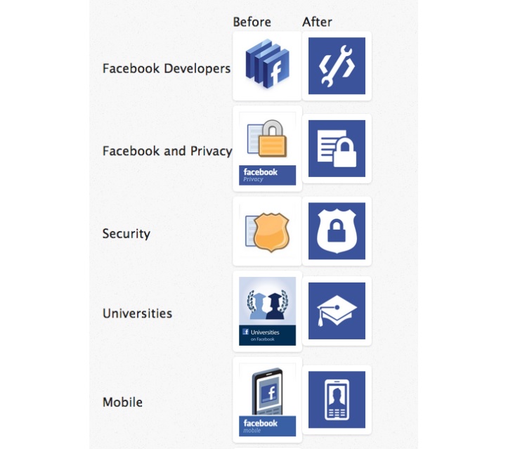
Facebook is one of the first to adapt the design format. In the past weeks, Facebook has evidently changed their design schemes, allowing users to see simple icons, designs and more eye-friendly visuals. Google has also followed the lead by changing its icons to colorful yet flat images.
Flat Design in the Web
To design an effective flat site, all design elements must be centered on this idea of simplicity. Everything should be designed with the same goal in mind to create a cohesive visual and functional web design that enriches the content over everything else.
There are many benefits to flat design, such as simplicity and minimalism that makes for a certain ease of use but taking minimalism too far can have serious consequences on usability. Basically, the flat design style is rooted on two principles: simplicity and readability.
Users have come to rely on a lot of subtle clues to make their way through an interface: buttons have slight gradients and rounded corners, form fields have a soft inner shadow, and navigation bars “float” over the rest of the content.
Remove all these clues, and you end up with a flat world where every element is suddenly placed at the same level, potentially leading to confusion: Is this really a button?

Above: Examples of colors used in Flat Design
It is responsibility of designers and web designers to don’t take this design aesthetic too far and exaggerate its use complicating the experience of the user.


Comments